
How to Build a Custom Accessibility Widget in React — With Font Size, Contrast, Text Spacing & Hide Images
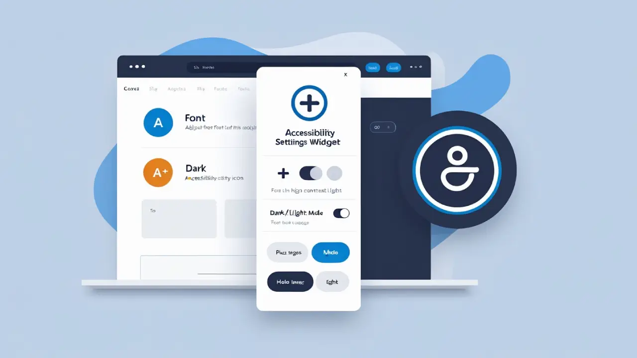
Making your website accessible is not just good practice, it’s essential to ensure all users can navigate and enjoy your content comfortably. A custom accessibility widget empowers visitors to adjust the UI to their needs — from changing font size to toggling high contrast or hiding images.
In this tutorial, I’ll walk you through building a flexible Accessibility Widget in React with multiple features:
- Font size adjustment
- High contrast toggle
- Dyslexic-friendly font
- Text spacing control
- Hide images toggle
All controlled from a simple floating button with an expandable settings panel.
Step 1: Setting up State for Accessibility Options
We use React’s useState hook to keep track of each accessibility setting. Here’s the full list we’ll control:
- fontSize (percentage, default 100%)
- highContrast (boolean)
- dyslexicFont (boolean)
- textSpacing (in pixels, default 0)
- hideImages (boolean)
const [fontSize, setFontSize] = useState(100);
const [highContrast, setHighContrast] = useState(false);
const [dyslexicFont, setDyslexicFont] = useState(false);
const [textSpacing, setTextSpacing] = useState(0);
const [hideImages, setHideImages] = useState(false);
Step 2: Applying Accessibility Styles Dynamically
With useEffect, we listen for changes in any of these states and update the DOM accordingly:
- Adjust the root font size via document.documentElement.style.fontSize
- Toggle CSS classes on <body> for high contrast and dyslexic font styles
- Apply letter spacing and word spacing directly on the body style
- Show or hide all <img> elements by toggling their display style
useEffect(() => {
  document.documentElement.style.fontSize = fontSize + "%";
  document.body.classList.toggle("high-contrast", highContrast);
  document.body.classList.toggle("dyslexic-font", dyslexicFont);
  document.body.style.letterSpacing = textSpacing + "px";
  document.body.style.wordSpacing = textSpacing * 2 + "px";
  const images = document.querySelectorAll("img");
  images.forEach(img => {
    img.style.display = hideImages ? "none" : "";
  });
}, [fontSize, highContrast, dyslexicFont, textSpacing, hideImages]);
Step 3: Building the User Interface
We have a floating button on the right center of the screen. Clicking toggles a panel where users can adjust settings:
<button
  onClick={() => setIsOpen(!isOpen)}
  className="fixed right-4 top-1/2 transform -translate-y-1/2 z-50 bg-blue-600 text-white rounded-full shadow-lg hover:bg-blue-700"
  aria-label="Accessibility Menu"
>
  <img src="./images/access.webp" alt="Accessibility Icon" />
</button>
When open, the panel shows:
- Font size controls with A− and A+ buttons
- Contrast toggle integrated with your existing <ThemeToggle /> component
- Text spacing controls with +/- buttons and current value display
- Hide images checkbox
- Dyslexic-friendly font checkbox
{isOpen && (
  <div className="fixed right-16 top-1/2 transform -translate-y-1/2 z-50 bg-white p-4 rounded-lg shadow-lg w-64 dark:bg-[#001D3A] dark:border dark:border-[#fff]">
    <h2 className="text-lg font-semibold mb-2">Accessibility Settings</h2>

    <div className="mb-2 gap-3">
      <label className="block mb-1">Font Size</label>
      <div className="flex gap-2">
        <button onClick={() => setFontSize(f => Math.max(80, f - 10))} className="btn px-2 border">A−</button>
        <button onClick={() => setFontSize(f => Math.min(150, f + 10))} className="btn px-2 border">A+</button>
      </div>
    </div>

    <div className="mb-2 flex gap-3">
      <label className="block mb-1">Change Contrast</label>
      <ThemeToggle />
    </div>

    <div className="mb-3 gap-3">
      <label className="block mb-1">Text Spacing</label>
      <div className="flex gap-2 items-center">
        <button onClick={() => setTextSpacing(s => Math.max(0, s - 0.5))} className="btn px-2 border" aria-label="Decrease text spacing">−</button>
        <span>{textSpacing.toFixed(1)} px</span>
        <button onClick={() => setTextSpacing(s => Math.min(5, s + 0.5))} className="btn px-2 border" aria-label="Increase text spacing">+</button>
      </div>
    </div>

    <div className="mb-2">
      <label className="flex items-center gap-3">
        <input type="checkbox" checked={hideImages} onChange={() => setHideImages(v => !v)} />
        Hide Images
      </label>
    </div>

    <div className="mb-2">
      <label className="flex items-center gap-3">
        <input type="checkbox" checked={dyslexicFont} onChange={() => setDyslexicFont(v => !v)} />
        Dyslexic-friendly font
      </label>
    </div>
  </div>
)}
Step 4: Adding Supporting CSS
Make sure to define styles for .high-contrast and .dyslexic-font in your CSS or Tailwind setup: css Copy Edit
body.high-contrast {
  background-color: #000 !important;
  color: #fff !important;
}

body.dyslexic-font {
  font-family: "OpenDyslexic", Arial, sans-serif !important;
}